

Designing the on-the-go experience for the documents tab in QuestMobile in time for tax season
Questrade
,
Fintech

2024
Overview
QuestMobile is Questrade's official investment app — Questrade is Canada's largest independent online brokerage, managing billions in assets as an alternative to traditional banks.
I designed the end-to-end experience to bring the documents area from the web portal to the app, including upload, form search, statements, and tax slips. Everything shipped in two phases, ensuring tax slips were available in the app in time for tax season.
Results
Financial documents available in the app in time for the annual peak demand
Phased delivery in 2 releases without compromising the Canadian tax season
Replicable navigation pattern created for all self-service tabs
The problem
In Canada, tax season runs from February to April, when financial institutions issue tax slips detailing each client's earnings from the previous year. It's the annual peak for financial document access, and at Questrade this access existed only on the web portal — a poor experience for anyone needing to check documents on the go.

Learnings
The race against Canada's tax season
The project was to bring the full documents area to the app, but with tax season approaching, we phased the launch. Tax slips came first, as they were the documents nearly the entire user base would need to access in the following weeks.
In phase 1, three decisions shaped the experience: a Home entry point leading directly to tax slips, a notice informing when the fiscal year documents would be available (preventing support tickets), and navigation with no intermediate steps.
Phase 2 arrived a month later with the Documents tab, statements, and the migration of tax slips into this new structure.
Fase 1
Phase 2

Designing a future-proof pattern
The documents tab belongs to a family of self-service pages in the app, where users handle on their own what previously required the web portal or a support agent.
I noticed these pages hold different content but share the same nature. This opened the opportunity to standardize — instead of designing a bespoke structure just for Documents, I classified content into three replicable categories: primary actions (what the user executes), snapshots (previews leading to child features), and histories (records checked from time to time).
To define the hierarchy, I combined two criteria: each page's job, which placed primary actions at the top as potentially blocking; and web portal Analytics data, which calibrated the rest by access frequency.
The structure was born in Documents and was ready to be replicated.
Main actions

Child pages' entry points
History (infinite scroll)
Page
Structure definition used across self-service feature pages.
When experience speaks louder than consistency
Maintaining consistency was a project value, but it couldn't come at the cost of real-world fit. On the web portal, statements and tax slips followed the same grouping logic by account. Before repeating this in the app, I investigated whether the pattern worked for the mobile context.
I wrote usage scenarios and brought them to an investigation with the PO. We found that, unlike tax slips (downloaded by account, since Canadian tax filing is done account by account), the most common behavior for statements was searching for a specific month's document. So statements were grouped by month.
This way, each document ended up organized the way it's used in the real world, prioritizing efficiency even at the cost of consistency with the web portal.
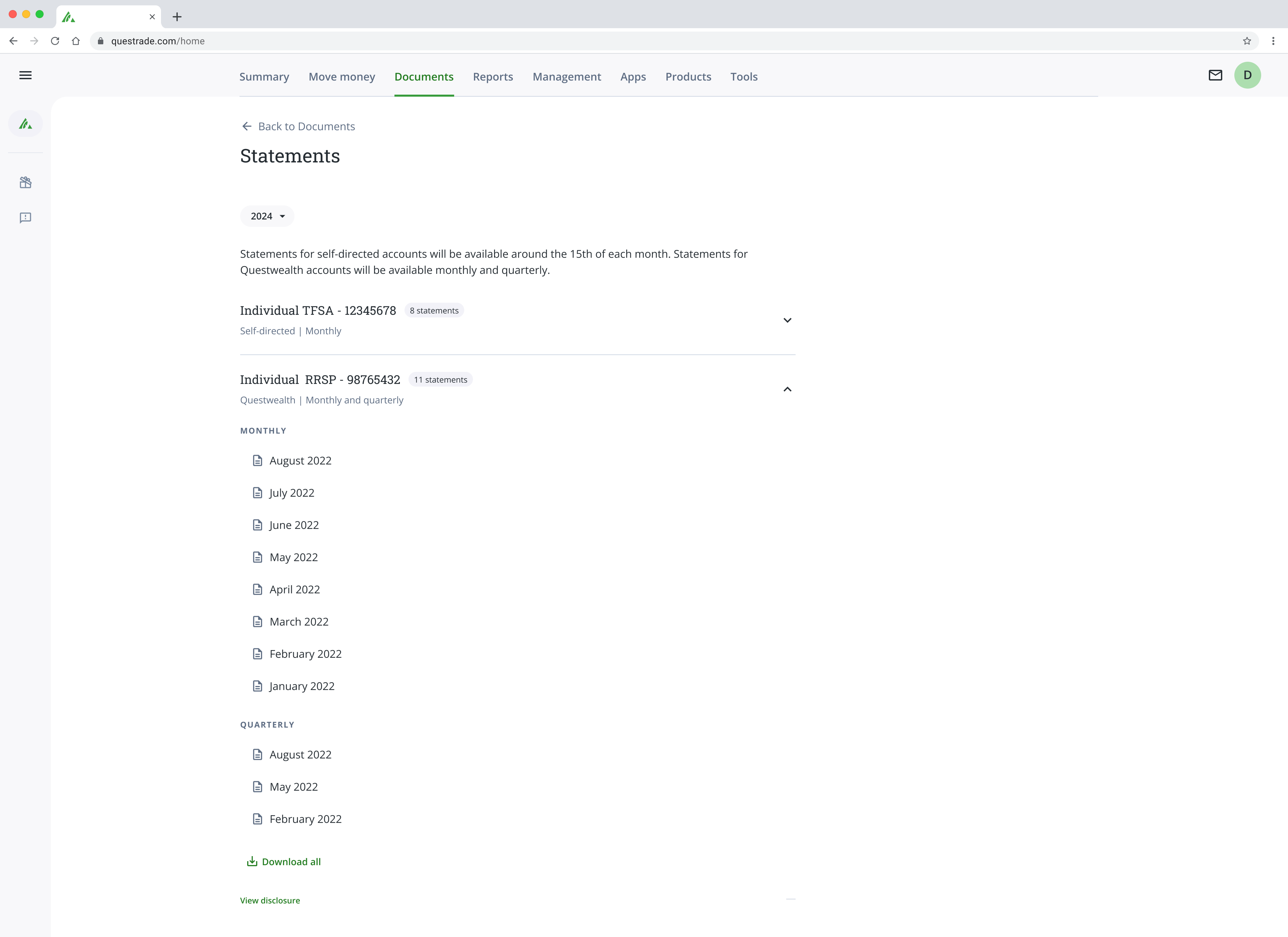
Página ’Statements’ no portal web.
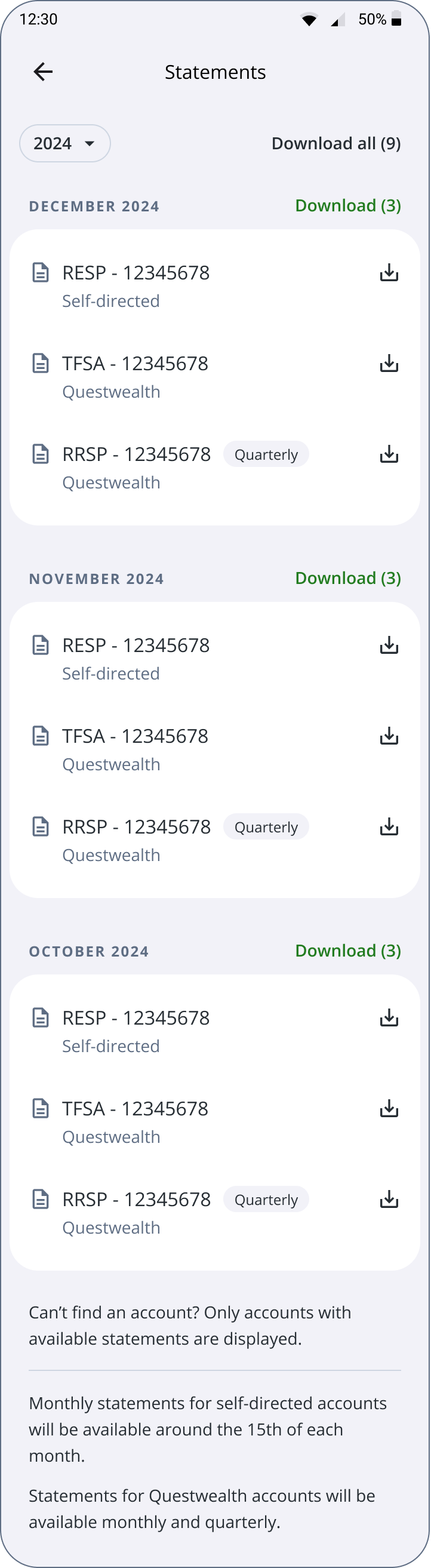
Statements in the app.
Impact
Tax slips and statements in the app at peak annual demand, with an experience designed for on-the-go use.
Single navigation pattern for self-service tabs, born in Documents and ready for replication.
More projects
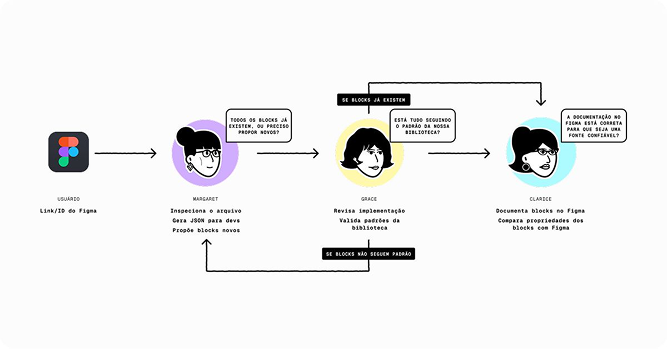
Applying AI to reduce an operational process from 36 to 1 hour of work
Bemobi Wave
,
Telecom e Utilities
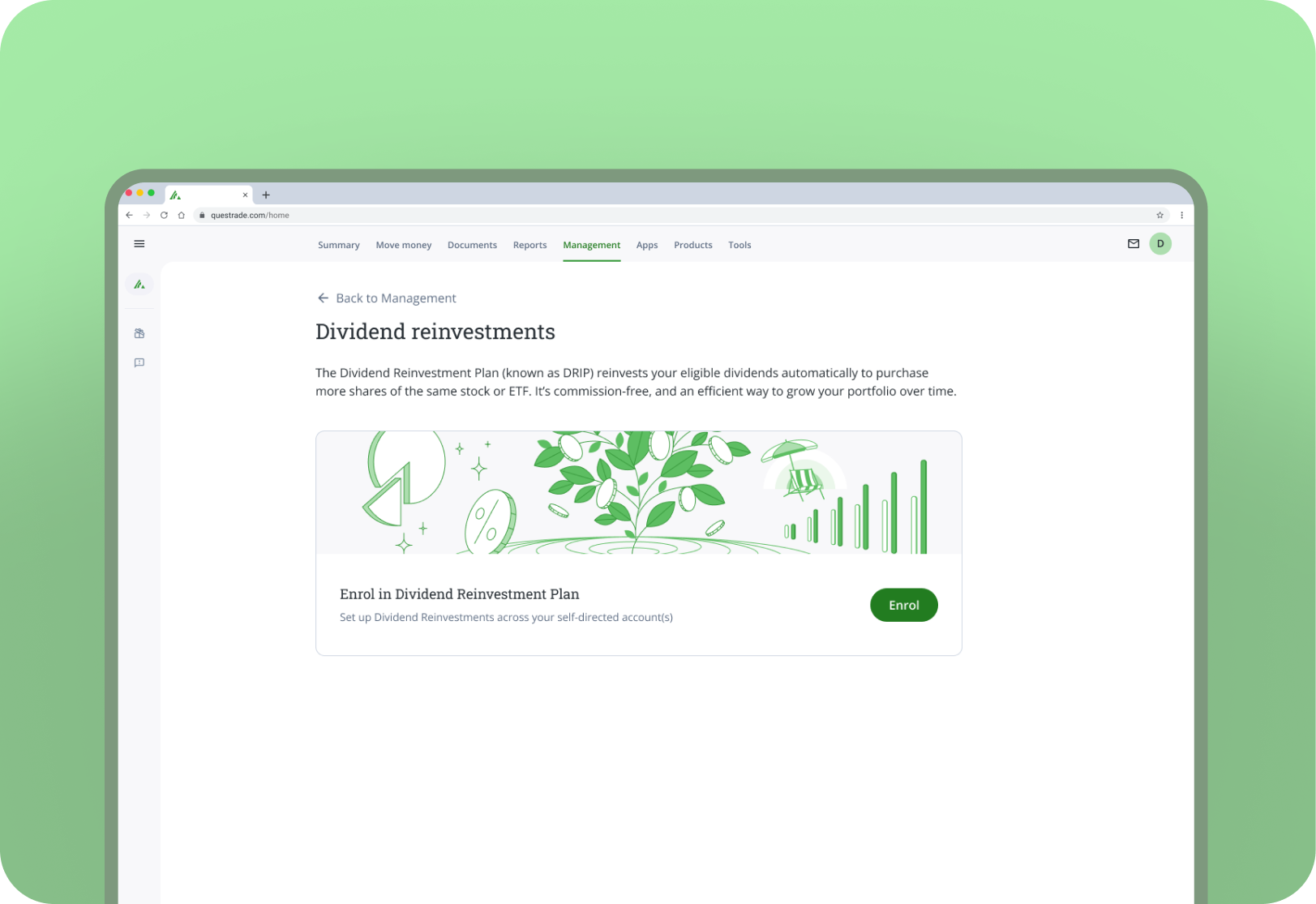
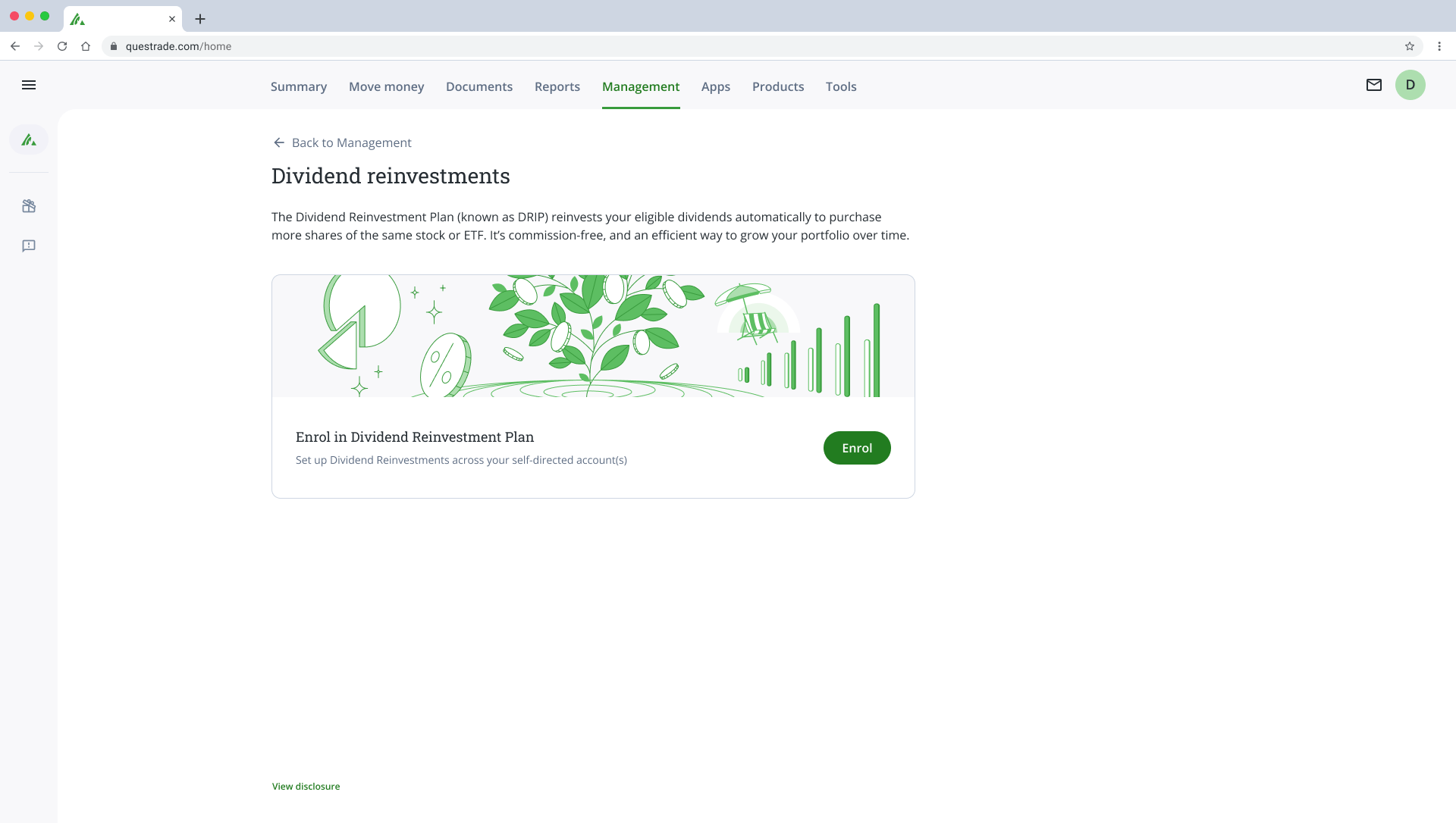
Reducing the dividend reinvestment program enrollment from 2 days to 8 seconds
Questrade
,
Fintech
Soon
Turning terabytes of geospatial data into accessible dashboards for 1 million users
MapBiomas
,
Geotech




© Cajá ・ Senior Product Designer ・ 2026
Designing the on-the-go experience for the documents tab in QuestMobile in time for tax season
Questrade
,
Fintech
2024
Overview
QuestMobile is Questrade's official investment app — Questrade is Canada's largest independent online brokerage, managing billions in assets as an alternative to traditional banks.
I designed the end-to-end experience to bring the documents area from the web portal to the app, including upload, form search, statements, and tax slips. Everything shipped in two phases, ensuring tax slips were available in the app in time for tax season.
Results
Financial documents available in the app in time for the annual peak demand
Phased delivery in 2 releases without compromising the Canadian tax season
Replicable navigation pattern created for all self-service tabs
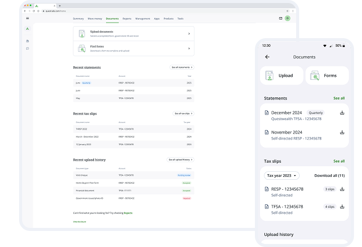
The problem
In Canada, tax season runs from February to April, when financial institutions issue tax slips detailing each client's earnings from the previous year. It's the annual peak for financial document access, and at Questrade this access existed only on the web portal — a poor experience for anyone needing to check documents on the go.

Learnings
The race against Canada's tax season
The project was to bring the full documents area to the app, but with tax season approaching, we phased the launch. Tax slips came first, as they were the documents nearly the entire user base would need to access in the following weeks.
In phase 1, three decisions shaped the experience: a Home entry point leading directly to tax slips, a notice informing when the fiscal year documents would be available (preventing support tickets), and navigation with no intermediate steps.
Phase 2 arrived a month later with the Documents tab, statements, and the migration of tax slips into this new structure.
Phase 1
Phase 2

Designing a future-proof pattern
The documents tab belongs to a family of self-service pages in the app, where users handle on their own what previously required the web portal or a support agent.
I noticed these pages hold different content but share the same nature. This opened the opportunity to standardize — instead of designing a bespoke structure just for Documents, I classified content into three replicable categories: primary actions (what the user executes), snapshots (previews leading to child features), and histories (records checked from time to time).
To define the hierarchy, I combined two criteria: each page's job, which placed primary actions at the top as potentially blocking; and web portal Analytics data, which calibrated the rest by access frequency.
The structure was born in Documents and was ready to be replicated.
Main actions
Child pages' entry points
History (infinite scroll)
Page
Structure definition used across self-service feature pages.
When experience speaks louder than consistency
Maintaining consistency was a project value, but it couldn't come at the cost of real-world fit. On the web portal, statements and tax slips followed the same grouping logic by account. Before repeating this in the app, I investigated whether the pattern worked for the mobile context.
I wrote usage scenarios and brought them to an investigation with the PO. We found that, unlike tax slips (downloaded by account, since Canadian tax filing is done account by account), the most common behavior for statements was searching for a specific month's document. So statements were grouped by month.
This way, each document ended up organized the way it's used in the real world, prioritizing efficiency even at the cost of consistency with the web portal.
'Statements' page on the web portal.
Statements in the app.
Impact
Tax slips and statements in the app at peak annual demand, with an experience designed for on-the-go use.
Single navigation pattern for self-service tabs, born in Documents and ready for replication.
More projects
Applying AI to reduce an operational process from 36 to 1 hour of work
Bemobi Wave
,
Telecom e Utilities
Soon
Turning terabytes of geospatial data into accessible dashboards for 1 million users
MapBiomas
,
Geotech
© Cajá ・ Senior Product Designer ・ 2026
Designing the on-the-go experience for the documents tab in QuestMobile in time for tax season
Questrade
,
Fintech
2024
Overview
QuestMobile is Questrade's official investment app — Questrade is Canada's largest independent online brokerage, managing billions in assets as an alternative to traditional banks.
I designed the end-to-end experience to bring the documents area from the web portal to the app, including upload, form search, statements, and tax slips. Everything shipped in two phases, ensuring tax slips were available in the app in time for tax season.
Results
Financial documents available in the app in time for the annual peak demand
Phased delivery in 2 releases without compromising the Canadian tax season
Replicable navigation pattern created for all self-service tabs
The problem
In Canada, tax season runs from February to April, when financial institutions issue tax slips detailing each client's earnings from the previous year. It's the annual peak for financial document access, and at Questrade this access existed only on the web portal — a poor experience for anyone needing to check documents on the go.

Learnings
The race against Canada's tax season
The project was to bring the full documents area to the app, but with tax season approaching, we phased the launch. Tax slips came first, as they were the documents nearly the entire user base would need to access in the following weeks.
In phase 1, three decisions shaped the experience: a Home entry point leading directly to tax slips, a notice informing when the fiscal year documents would be available (preventing support tickets), and navigation with no intermediate steps.
Phase 2 arrived a month later with the Documents tab, statements, and the migration of tax slips into this new structure.
Phase 1
Phase 2

Designing a future-proof pattern
The documents tab belongs to a family of self-service pages in the app, where users handle on their own what previously required the web portal or a support agent.
I noticed these pages hold different content but share the same nature. This opened the opportunity to standardize — instead of designing a bespoke structure just for Documents, I classified content into three replicable categories: primary actions (what the user executes), snapshots (previews leading to child features), and histories (records checked from time to time).
To define the hierarchy, I combined two criteria: each page's job, which placed primary actions at the top as potentially blocking; and web portal Analytics data, which calibrated the rest by access frequency.
The structure was born in Documents and was ready to be replicated.
Main actions
Child pages' entry points
History (infinite scroll)
Page
Structure definition used across self-service feature pages.
When experience speaks louder than consistency
Maintaining consistency was a project value, but it couldn't come at the cost of real-world fit. On the web portal, statements and tax slips followed the same grouping logic by account. Before repeating this in the app, I investigated whether the pattern worked for the mobile context.
I wrote usage scenarios and brought them to an investigation with the PO. We found that, unlike tax slips (downloaded by account, since Canadian tax filing is done account by account), the most common behavior for statements was searching for a specific month's document. So statements were grouped by month.
This way, each document ended up organized the way it's used in the real world, prioritizing efficiency even at the cost of consistency with the web portal.
'Statements' page on the web portal.
Statements in the app.
Impact
Tax slips and statements in the app at peak annual demand, with an experience designed for on-the-go use.
Single navigation pattern for self-service tabs, born in Documents and ready for replication.
More projects
Applying AI to reduce an operational process from 36 to 1 hour of work
Bemobi Wave
,
Telecom e Utilities
Soon
Turning terabytes of geospatial data into accessible dashboards for 1 million users
MapBiomas
,
Geotech
© Cajá ・ Senior Product Designer ・ 2026