Establishing the navigation pattern for self-service tabs in Questrade's app
QuestMobile is Questrade's official investment app, the largest independent online brokerage in Canada. In this project, I created the navigation pattern for the app's self-service tabs, starting with the Documents tab, which includes document uploads, form search, statements, and tax slips. The delivery was phased into two releases to ensure tax documents were available in time for the Canadian tax season.
My role
Product Designer
Scope
From discovery to delivery, end to end
Team
Product Managers and developers
The problem
With tax season approaching, Questrade needed to make tax slips and statements accessible in the app. Until then, these features only existed on the web portal, along with other self-service areas that also needed to be adapted to mobile. Since all of them were built around the desktop experience, the project became an opportunity to create a single navigation pattern, starting with the tab with the highest seasonal impact.
The solution
By analyzing the self-service tabs, I identified that they all shared the same content nature, which opened the opportunity to create a replicable navigation pattern instead of a custom solution for each tab. This pattern was born in Documents, where I designed the statements and tax slips experience for on-the-go use. Since tax season imposed a real deadline, I phased the delivery into two releases, prioritizing tax slips in phase one to ensure they were in the app on time.
The impact
The navigation pattern created in Documents was adopted by the other self-service tabs in the app, becoming the reference for future implementations. Statements and tax slips became accessible in the app during peak annual demand, with an experience designed for mobile use. The phased delivery in two releases ensured tax documents were available without compromising the tax season deadline.
Three key insights
01. Different content organized by the same logic, in a structure built to scale from day one 02. Each phase needed to deliver a complete experience, not an incomplete version of the next 03. When experience speaks louder than consistency
Insight 01
Different content organized by the same logic, in a structure built to scale from day one
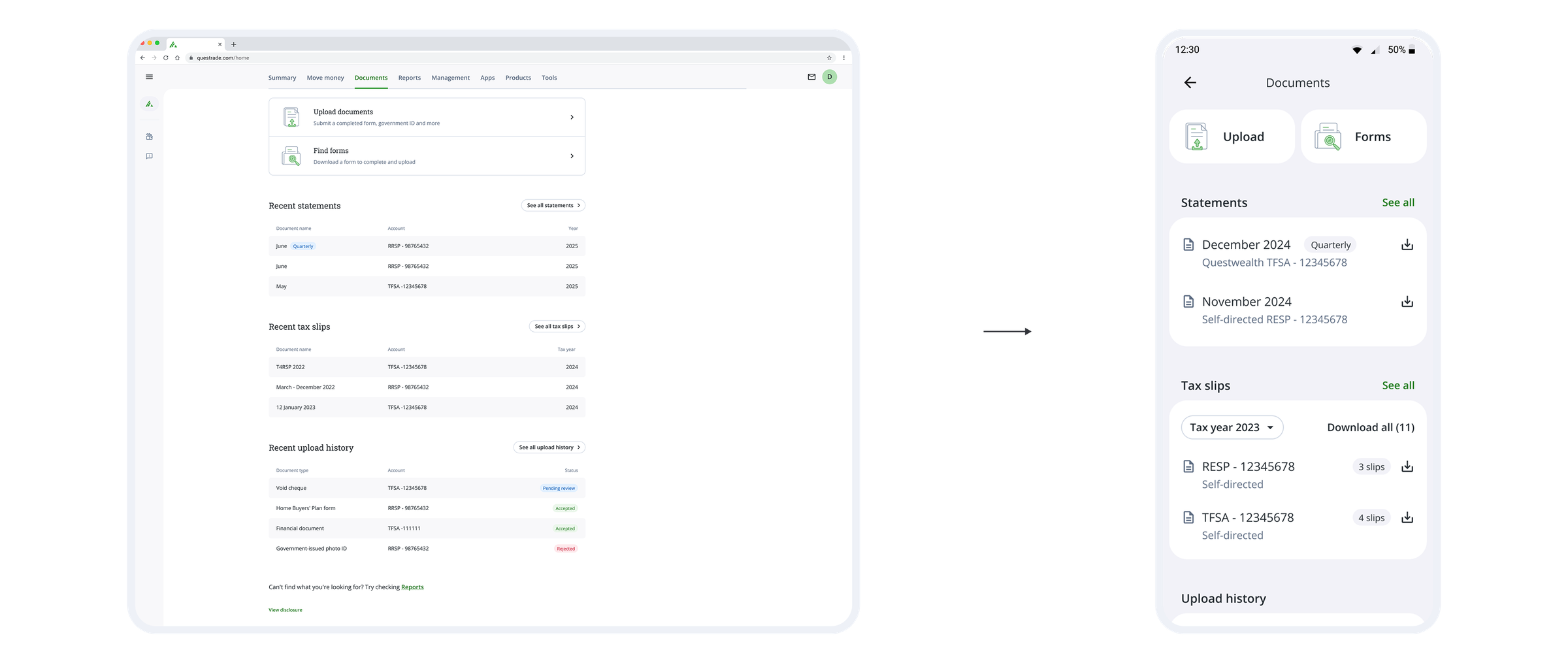
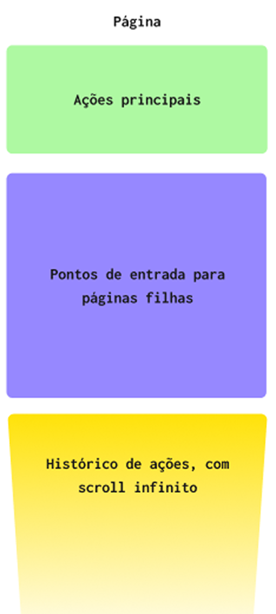
The Documents tab belongs to a family of self-service pages in the app, built for tasks like document uploads, statement lookups, and form search. By analyzing these pages, I noticed they held different content but shared the same nature, which opened the opportunity to standardize instead of creating a custom structure for each tab. I classified the content into three replicable categories: primary actions, snapshots, and history. The hierarchy between them combined each page's core job with Analytics data from the web portal, prioritizing blocking actions at the top and calibrating the rest by access frequency. The structure was born in Documents and was ready to be replicated across the remaining tabs.
Insight 02
Each phase needed to deliver a complete experience, not an incomplete version of the next
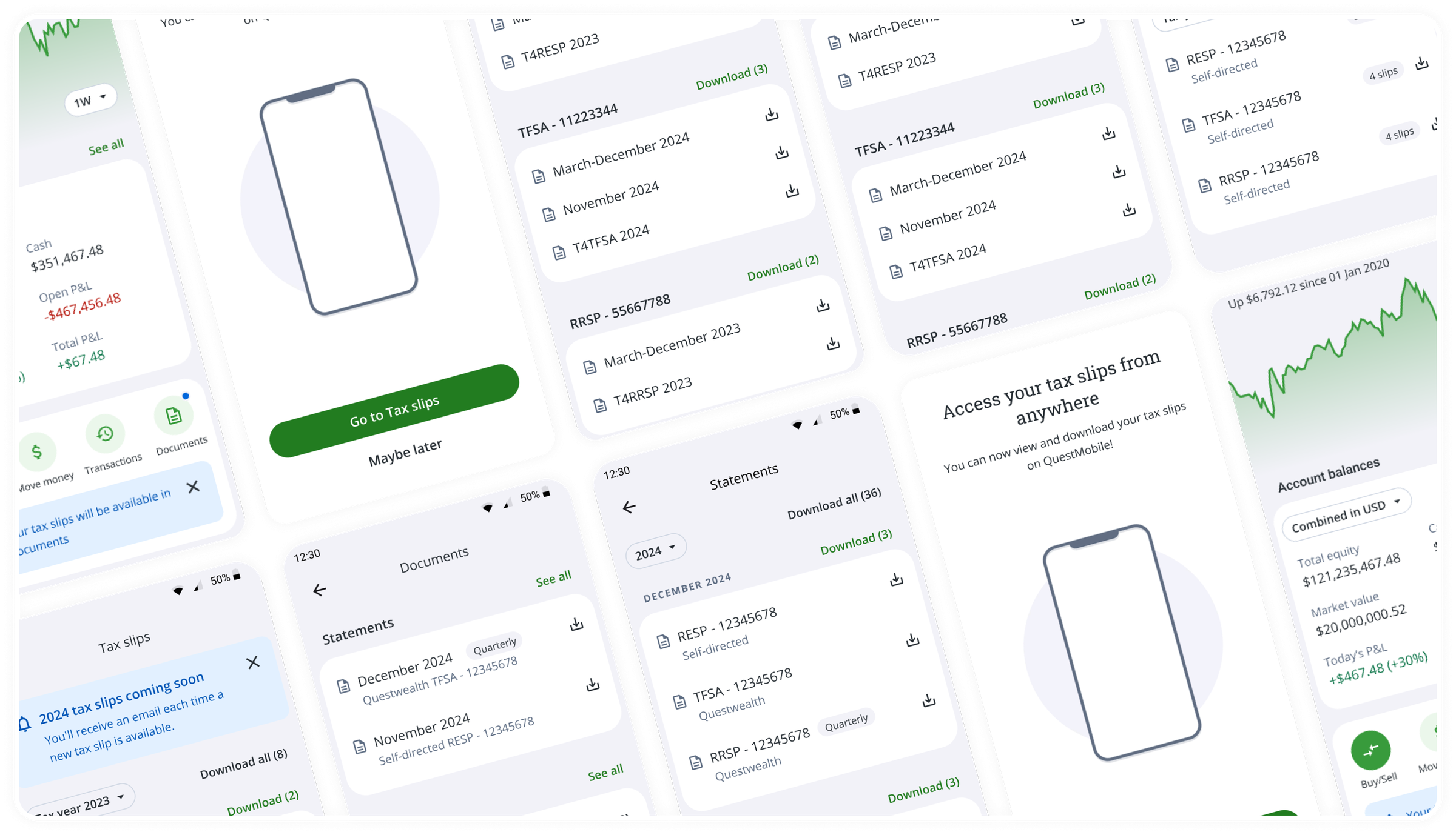
The project was to bring the full documents area to the app, but with tax season approaching, I decided to launch tax slips first, since they were the documents that virtually the entire user base would need to access in the following weeks. In phase 2, launched a month later, the Documents page started bringing together other document types, which needed to be accommodated without breaking the flow users had already learned.
Insight 03
When experience speaks louder than consistency
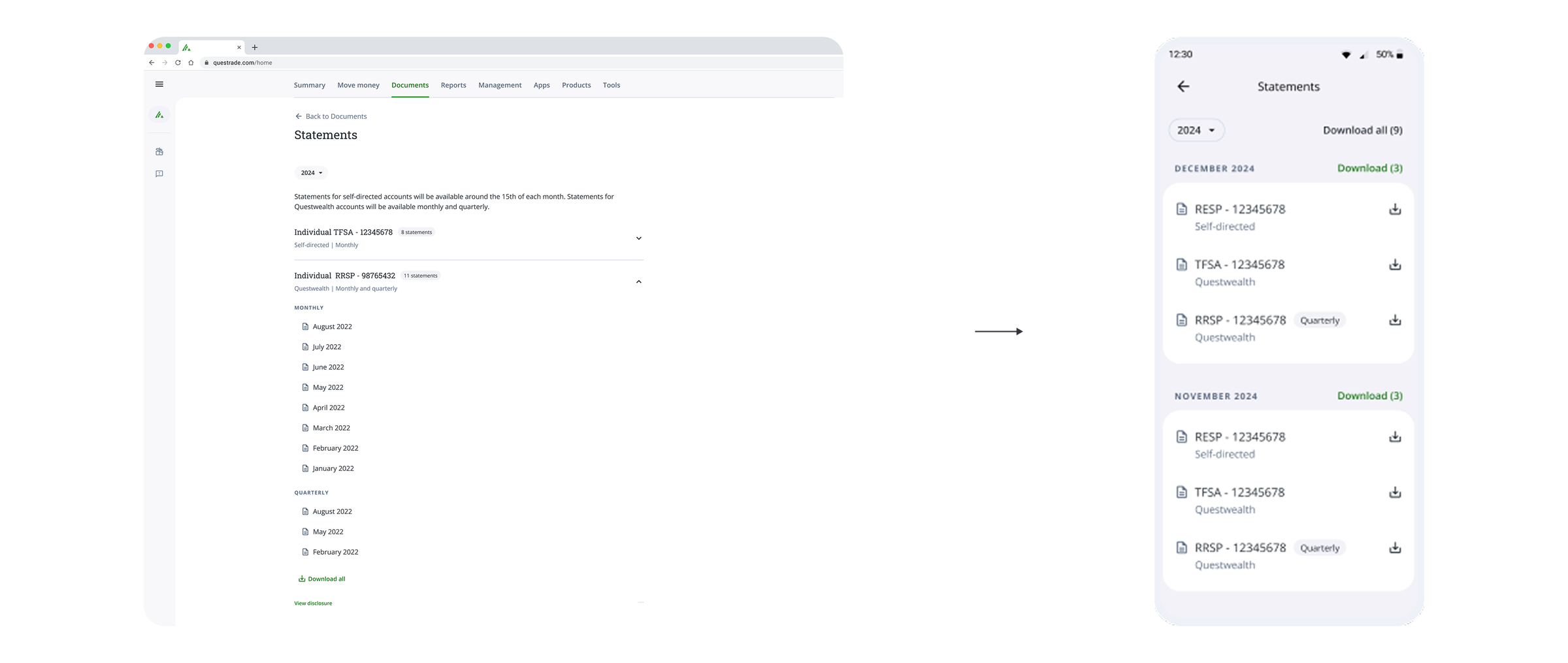
Consistency was a project value, but it couldn't come at the cost of real-world adequacy. On the web portal, statements and tax slips followed the same grouping logic by account. I treated the migration to the app as an opportunity to revisit that structure, wrote usage scenarios, and brought them to an investigation with the PO. We understood that tax slips are downloaded by account (because Canadian tax filing is done account by account), but the most common behavior for statements was searching for a specific month's document. Statements were then grouped by month, prioritizing usage efficiency even at the cost of consistency with the web portal.
Results
- Created a replicable navigation pattern for all self-service tabs.
- Tax documents accessible in the app in time for peak annual demand.
- Phased delivery in two releases, without compromising the Canadian tax season deadline.