




QUESTRADE
FINTECH
APP

From the web portal to the app: how I designed the documents area of QuestMobile, Questrade's app

QuestMobile is Questrade's official investment app, one of Canada's largest brokerages, developed to democratize the stock and ETF market through a fast and intuitive mobile experience.
Overview
In Canada, the tax season occurs between February and April. During this time, financial institutions issue tax slips: reports detailing each client's earnings from the previous year. With the filing deadline on April 30, it is the annual peak for accessing financial documents.
At Questrade, it was precisely during this peak that the limitation appeared: access to documents was only available on the web portal, with a user experience that was not suitable for those needing to consult them on-the-go.
The project I developed moved the document-related functionalities to the QuestMobile app, including file uploads to the brokerage, form searches, account statements, tax slips, and upload history. The expectation was to facilitate clients' access to documents and leverage the tax season to increase app usage.
I designed the end-to-end experience, which included studying the navigation structure of the Documents tab, phasing and prioritizing deliverables, and reviewing functionalities on the web app. Everything went live in two phases and ensured that tax slips were available in the app in time for tax season.
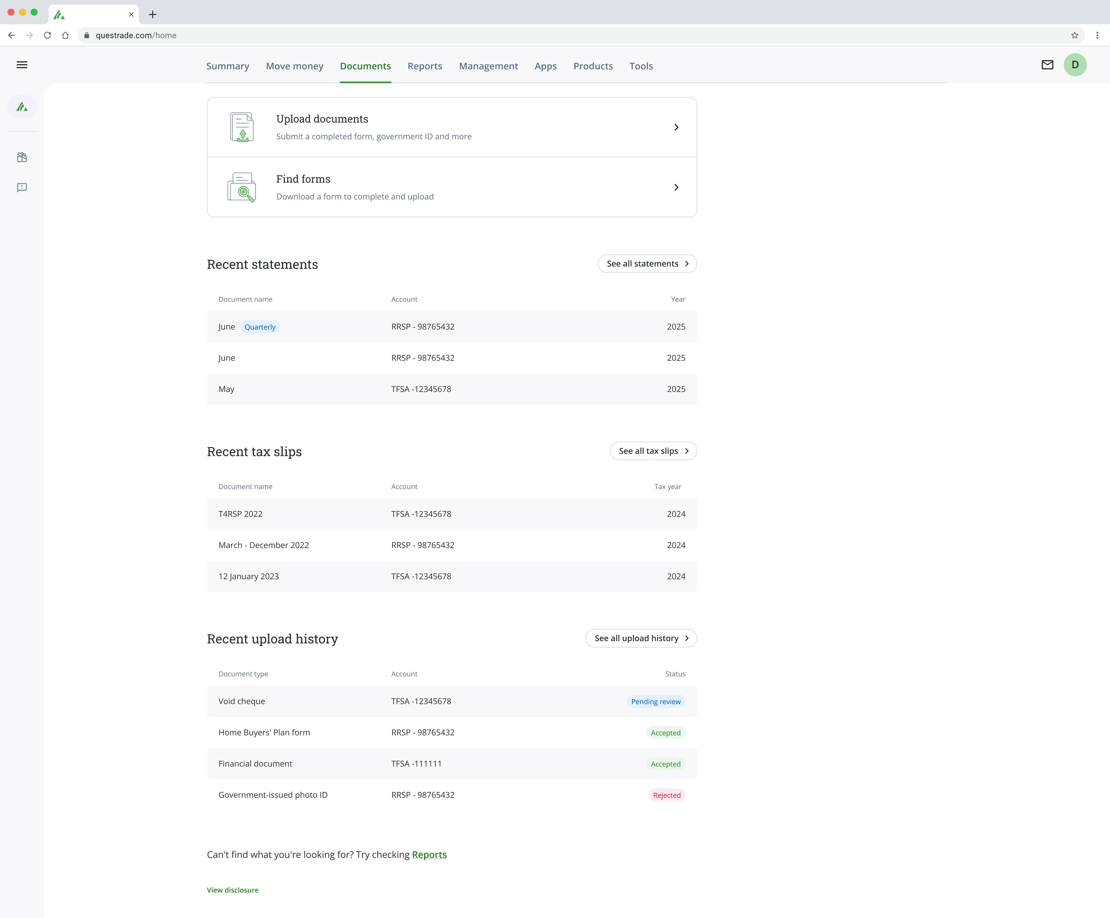
'Documents' tab on the web portal.
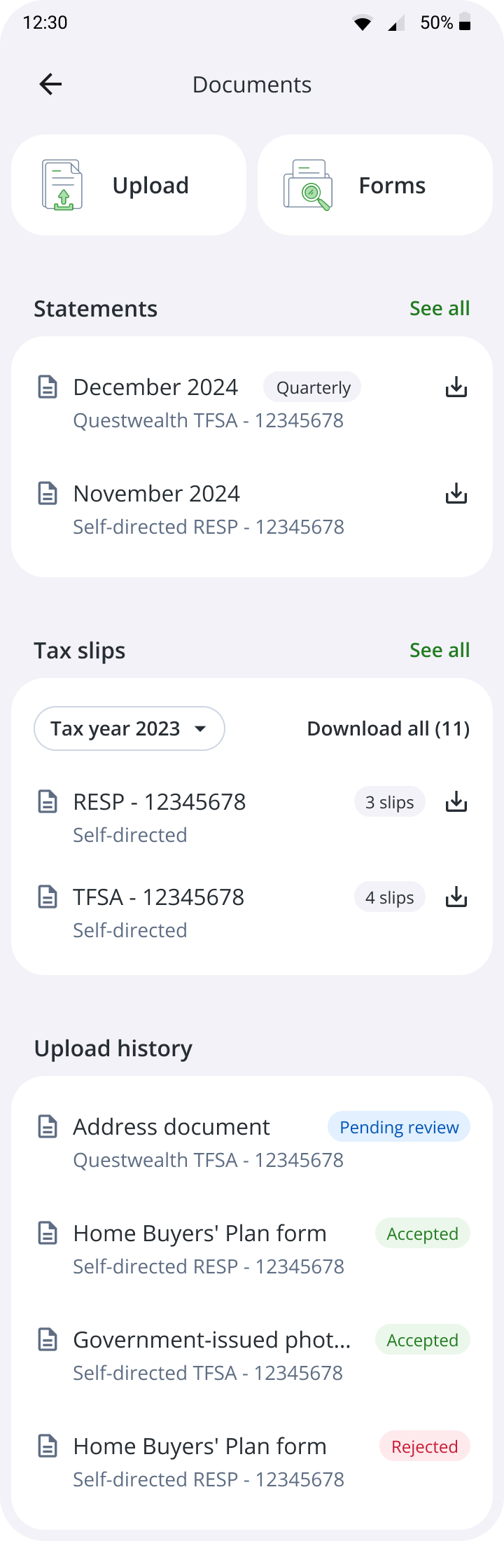
Explorations for the app.
Learnings
The race against Canada's tax season
The project was to bring the complete documents area from the web portal to QuestMobile. However, with tax season approaching, the decision with the product team was to phase the launch of functionalities. The tax slips came first, as they were the documents that nearly the entire user base would need to access in the following weeks.
In phase 1, three decisions shaped the experience. A dedicated entry point on the Home page led the client directly to the tax slips page, without intermediate navigation. Since the release dates of the slips vary by account type, we implemented a notice informing that the documents for that fiscal year would be available soon, providing context for those arriving early and preventing confusion from turning into a support ticket.
Phase 2 arrived a month later, with the implementation of the Documents tab and statements. In this new phase, tax slips were moved into Documents, and the design decision was to add a banner indicating this new path.
Phase 1.
Phase 2.

Designing a new standard, future-proof
The documents tab belongs to a specific family of pages in the app: self-service pages, where the client resolves tasks that previously depended on the web portal or a representative, such as consulting documents, generating reports, or moving money. These are pages where the user arrives with a task, executes it, and leaves.
I noticed that these pages gather different content but share the same nature. This opened the opportunity to standardize, and instead of designing a custom structure just for Documents, I classified the content into three categories common to any page in this family:
main actions: what the user executes (like submitting a document or searching for a form);
snapshots: previews that provide access to child functionalities (like tax slips and statements);
histories: records consulted from time to time (like upload history).
To organize them in the interface, I combined two criteria. The first was the job of each page: main actions are those that typically have the highest priority and can block a request, such as adding a beneficiary or signing up for a program offered by Questrade, and therefore need to be in a more visible area. The second criterion was the Analytics data from the web portal, which showed the monthly access frequency of each functionality and helped calibrate the hierarchy of the rest: snapshots next, and histories last. Thus, the structure was born in Documents and was ready to be replicated in subsequent pages.
Main actions

Entry points for child pages
Action history, with infinite scroll
Page
Definition of the structure used on pages where self-service functionalities reside.
When the experience speaks louder than consistency
Maintaining consistency was a value throughout the entire project, but it could not come at the cost of real-world usability. On the web portal, statements and tax slips followed the same grouping logic by account. Before repeating the pattern in the app, I preferred to investigate whether it served the mobile context.
I wrote usage scenarios covering the different ways to view or download a statement and took these scenarios to an investigation with the PO, who closely monitored customer behavior.
We understood together that, unlike tax slips, which the user downloads all at once by account, the most common behavior for statements was to search for a document from a specific month. Thus, the documents within this page began to be grouped by month, while tax slips remained grouped by account, because tax filing in Canada is done account by account.
In the end, each document was organized the way it is used in the real world. We prioritized usability efficiency, even understanding that this pattern meant a loss of consistency with the web portal.
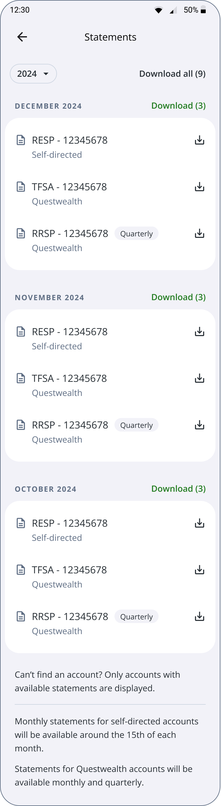
Statements in the app.
Impact
- Tax slips and statements available in the app at the annual peak of demand, with an experience designed for on-the-go use.
- A single navigation standard for the app tabs, designed from Documents and ready for the following functionalities.
Next projects

Bemobi Wave, 2026
TELECOM
UTILITIES
IA
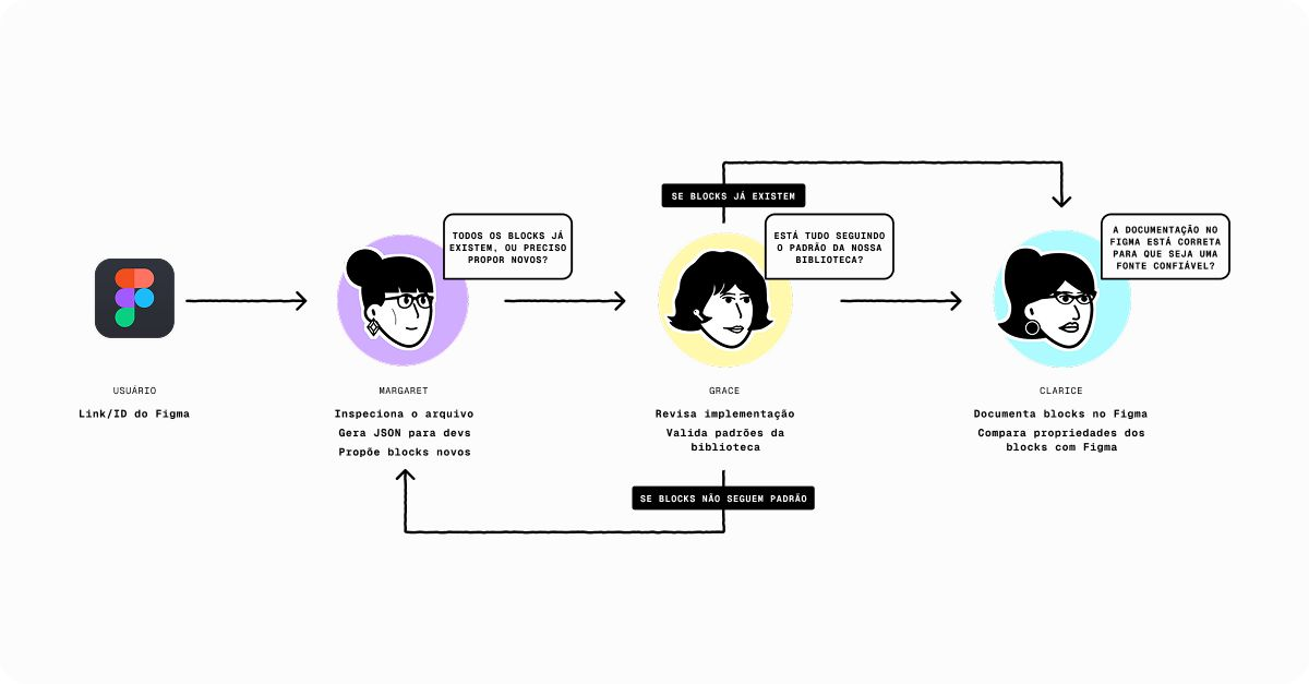
Teaching two design systems to communicate with Claude

Questrade, 2025
FINTECH
WEB
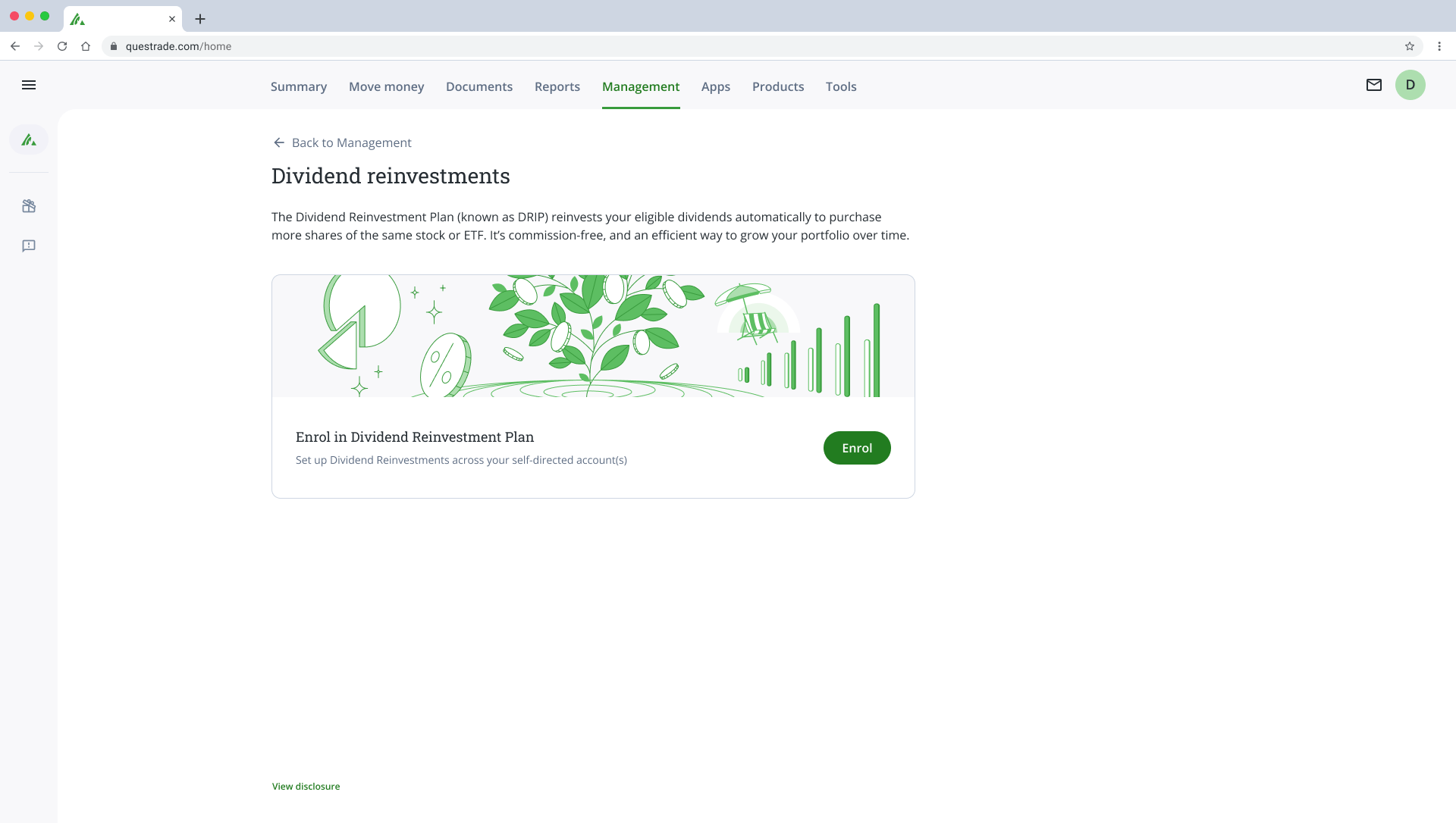
From 2 business days to 8 seconds: how I designed the automation of the enrollment process for Questrade's DRIP program
Cajá ・ Senior Product Designer ・ 2026

QUESTRADE
FINTECH
APP
From the web portal to the app: how I designed the documents area of QuestMobile, Questrade's app

QuestMobile is Questrade's official investment app, one of Canada's largest brokerages, developed to democratize the stock and ETF market through a fast and intuitive mobile experience.
Overview
In Canada, the tax season occurs between February and April. During this time, financial institutions issue tax slips: reports detailing each client's earnings from the previous year. With the filing deadline on April 30, it is the annual peak for accessing financial documents.
At Questrade, it was precisely during this peak that the limitation appeared: access to documents was only available on the web portal, with a user experience that was not suitable for those needing to consult them on-the-go.
The project I developed moved the document-related functionalities to the QuestMobile app, including file uploads to the brokerage, form searches, account statements, tax slips, and upload history. The expectation was to facilitate clients' access to documents and leverage the tax season to increase app usage.
I designed the end-to-end experience, which included studying the navigation structure of the Documents tab, phasing and prioritizing deliverables, and reviewing functionalities on the web app. Everything went live in two phases and ensured that tax slips were available in the app in time for tax season.
'Documents' tab on the web portal.
Explorations for the app.
Learnings
The race against Canada's tax season
The project was to bring the complete documents area from the web portal to QuestMobile. However, with tax season approaching, the decision with the product team was to phase the launch of functionalities. The tax slips came first, as they were the documents that nearly the entire user base would need to access in the following weeks.
In phase 1, three decisions shaped the experience. A dedicated entry point on the Home page led the client directly to the tax slips page, without intermediate navigation. Since the release dates of the slips vary by account type, we implemented a notice informing that the documents for that fiscal year would be available soon, providing context for those arriving early and preventing confusion from turning into a support ticket.
Phase 2 arrived a month later, with the implementation of the Documents tab and statements. In this new phase, tax slips were moved into Documents, and the design decision was to add a banner indicating this new path.
Phase 1.
Phase 2.

Designing a new standard, future-proof
The documents tab belongs to a specific family of pages in the app: self-service pages, where the client resolves tasks that previously depended on the web portal or a representative, such as consulting documents, generating reports, or moving money. These are pages where the user arrives with a task, executes it, and leaves.
I noticed that these pages gather different content but share the same nature. This opened the opportunity to standardize, and instead of designing a custom structure just for Documents, I classified the content into three categories common to any page in this family:
main actions: what the user executes (like submitting a document or searching for a form);
snapshots: previews that provide access to child functionalities (like tax slips and statements);
histories: records consulted from time to time (like upload history).
To organize them in the interface, I combined two criteria. The first was the job of each page: main actions are those that typically have the highest priority and can block a request, such as adding a beneficiary or signing up for a program offered by Questrade, and therefore need to be in a more visible area. The second criterion was the Analytics data from the web portal, which showed the monthly access frequency of each functionality and helped calibrate the hierarchy of the rest: snapshots next, and histories last. Thus, the structure was born in Documents and was ready to be replicated in subsequent pages.
Main actions
Entry points for child pages
Action history, with infinite scroll
Page
Definition of the structure used on pages where self-service functionalities reside.
When the experience speaks louder than consistency
Maintaining consistency was a value throughout the entire project, but it could not come at the cost of real-world usability. On the web portal, statements and tax slips followed the same grouping logic by account. Before repeating the pattern in the app, I preferred to investigate whether it served the mobile context.
I wrote usage scenarios covering the different ways to view or download a statement and took these scenarios to an investigation with the PO, who closely monitored customer behavior.
We understood together that, unlike tax slips, which the user downloads all at once by account, the most common behavior for statements was to search for a document from a specific month. Thus, the documents within this page began to be grouped by month, while tax slips remained grouped by account, because tax filing in Canada is done account by account.
In the end, each document was organized the way it is used in the real world. We prioritized usability efficiency, even understanding that this pattern meant a loss of consistency with the web portal.
Statements in the app.
Impact
- Tax slips and statements available in the app at the annual peak of demand, with an experience designed for on-the-go use.
- A single navigation standard for the app tabs, designed from Documents and ready for the following functionalities.
Next projects

Bemobi Wave, 2026
TELECOM
UTILITIES
IA
Teaching two design systems to communicate with Claude
Questrade, 2025
FINTECH
WEB
From 2 business days to 8 seconds: how I designed the automation of the enrollment process for Questrade's DRIP program
Cajá ・ Senior Product Designer ・ 2026

QUESTRADE
FINTECH
APP
From the web portal to the app: how I designed the documents area of QuestMobile, Questrade's app

QuestMobile is Questrade's official investment app, one of Canada's largest brokerages, developed to democratize the stock and ETF market through a fast and intuitive mobile experience.
Overview
In Canada, the tax season occurs between February and April. During this time, financial institutions issue tax slips: reports detailing each client's earnings from the previous year. With the filing deadline on April 30, it is the annual peak for accessing financial documents.
At Questrade, it was precisely during this peak that the limitation appeared: access to documents was only available on the web portal, with a user experience that was not suitable for those needing to consult them on-the-go.
The project I developed moved the document-related functionalities to the QuestMobile app, including file uploads to the brokerage, form searches, account statements, tax slips, and upload history. The expectation was to facilitate clients' access to documents and leverage the tax season to increase app usage.
I designed the end-to-end experience, which included studying the navigation structure of the Documents tab, phasing and prioritizing deliverables, and reviewing functionalities on the web app. Everything went live in two phases and ensured that tax slips were available in the app in time for tax season.
'Documents' tab on the web portal.
Explorations for the app.
Learnings
The race against Canada's tax season
The project was to bring the complete documents area from the web portal to QuestMobile. However, with tax season approaching, the decision with the product team was to phase the launch of functionalities. The tax slips came first, as they were the documents that nearly the entire user base would need to access in the following weeks.
In phase 1, three decisions shaped the experience. A dedicated entry point on the Home page led the client directly to the tax slips page, without intermediate navigation. Since the release dates of the slips vary by account type, we implemented a notice informing that the documents for that fiscal year would be available soon, providing context for those arriving early and preventing confusion from turning into a support ticket.
Phase 2 arrived a month later, with the implementation of the Documents tab and statements. In this new phase, tax slips were moved into Documents, and the design decision was to add a banner indicating this new path.
Phase 1.
Phase 2.

Designing a new standard, future-proof
The documents tab belongs to a specific family of pages in the app: self-service pages, where the client resolves tasks that previously depended on the web portal or a representative, such as consulting documents, generating reports, or moving money. These are pages where the user arrives with a task, executes it, and leaves.
I noticed that these pages gather different content but share the same nature. This opened the opportunity to standardize, and instead of designing a custom structure just for Documents, I classified the content into three categories common to any page in this family:
main actions: what the user executes (like submitting a document or searching for a form);
snapshots: previews that provide access to child functionalities (like tax slips and statements);
histories: records consulted from time to time (like upload history).
To organize them in the interface, I combined two criteria. The first was the job of each page: main actions are those that typically have the highest priority and can block a request, such as adding a beneficiary or signing up for a program offered by Questrade, and therefore need to be in a more visible area. The second criterion was the Analytics data from the web portal, which showed the monthly access frequency of each functionality and helped calibrate the hierarchy of the rest: snapshots next, and histories last. Thus, the structure was born in Documents and was ready to be replicated in subsequent pages.
Main actions
Entry points for child pages
Action history, with infinite scroll
Page
Definition of the structure used on pages where self-service functionalities reside.
When the experience speaks louder than consistency
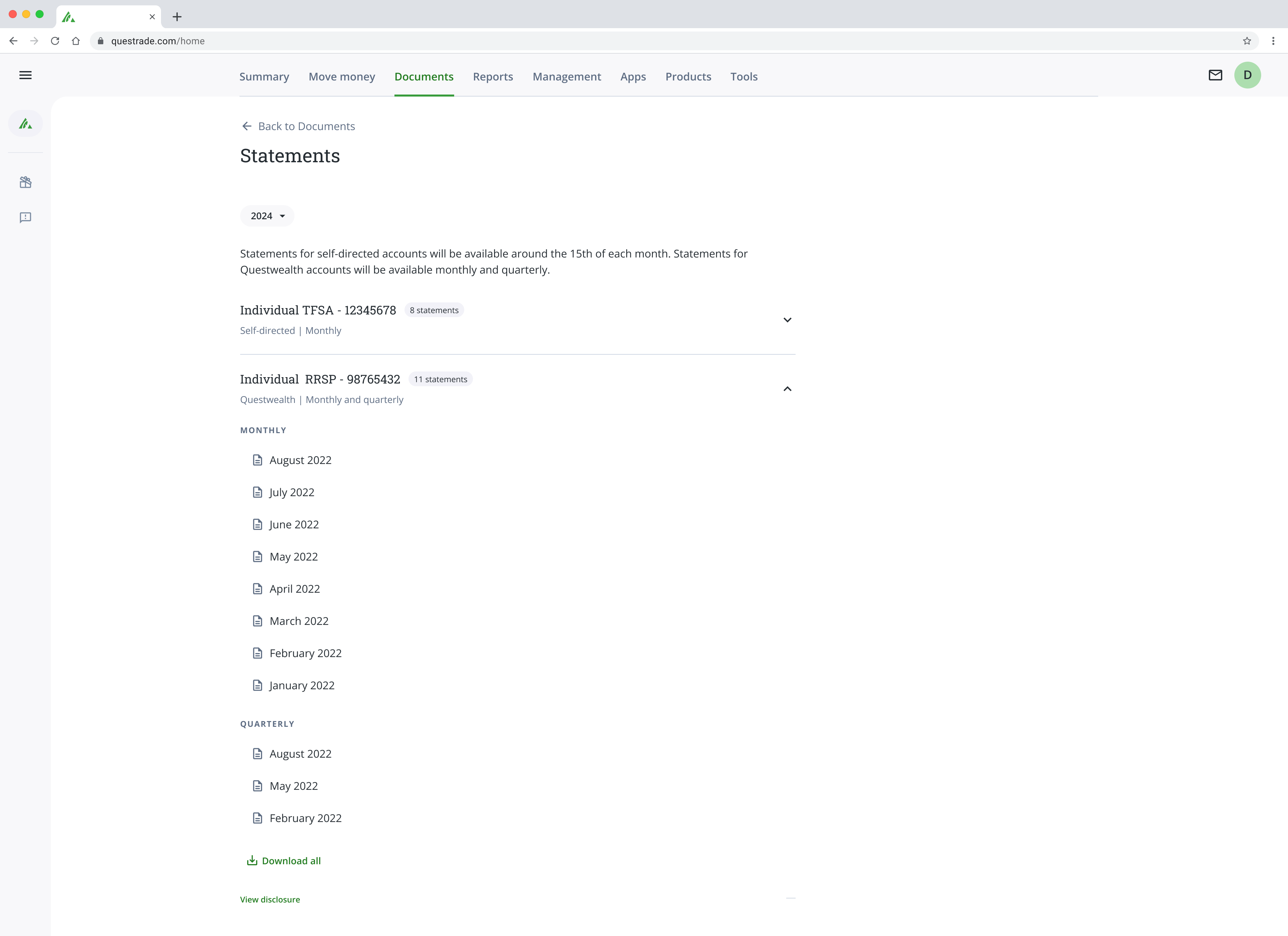
Maintaining consistency was a value throughout the entire project, but it could not come at the cost of real-world usability. On the web portal, statements and tax slips followed the same grouping logic by account. Before repeating the pattern in the app, I preferred to investigate whether it served the mobile context.
I wrote usage scenarios covering the different ways to view or download a statement and took these scenarios to an investigation with the PO, who closely monitored customer behavior.
We understood together that, unlike tax slips, which the user downloads all at once by account, the most common behavior for statements was to search for a document from a specific month. Thus, the documents within this page began to be grouped by month, while tax slips remained grouped by account, because tax filing in Canada is done account by account.
In the end, each document was organized the way it is used in the real world. We prioritized usability efficiency, even understanding that this pattern meant a loss of consistency with the web portal.
'Statements' page on the web portal.
Statements in the app.
Impact
- Tax slips and statements available in the app at the annual peak of demand, with an experience designed for on-the-go use.
- A single navigation standard for the app tabs, designed from Documents and ready for the following functionalities.


